practice1

%pip install pandas matplotlib numpy lets_plot
Requirement already satisfied: pandas in c:\users\hp\anaconda3\lib\site-packages (2.2.2)
Requirement already satisfied: matplotlib in c:\users\hp\anaconda3\lib\site-packages (3.9.2)
Requirement already satisfied: numpy in c:\users\hp\anaconda3\lib\site-packages (1.26.4)
Collecting lets_plot
  Using cached lets_plot-4.5.1-cp312-cp312-win_amd64.whl.metadata (11 kB)
Requirement already satisfied: python-dateutil>=2.8.2 in c:\users\hp\anaconda3\lib\site-packages (from pandas) (2.9.0.post0)
Requirement already satisfied: pytz>=2020.1 in c:\users\hp\anaconda3\lib\site-packages (from pandas) (2024.1)
Requirement already satisfied: tzdata>=2022.7 in c:\users\hp\anaconda3\lib\site-packages (from pandas) (2023.3)
Requirement already satisfied: contourpy>=1.0.1 in c:\users\hp\anaconda3\lib\site-packages (from matplotlib) (1.2.0)
Requirement already satisfied: cycler>=0.10 in c:\users\hp\anaconda3\lib\site-packages (from matplotlib) (0.11.0)
Requirement already satisfied: fonttools>=4.22.0 in c:\users\hp\anaconda3\lib\site-packages (from matplotlib) (4.51.0)
Requirement already satisfied: kiwisolver>=1.3.1 in c:\users\hp\anaconda3\lib\site-packages (from matplotlib) (1.4.4)
Requirement already satisfied: packaging>=20.0 in c:\users\hp\anaconda3\lib\site-packages (from matplotlib) (24.1)
Requirement already satisfied: pillow>=8 in c:\users\hp\anaconda3\lib\site-packages (from matplotlib) (10.4.0)
Requirement already satisfied: pyparsing>=2.3.1 in c:\users\hp\anaconda3\lib\site-packages (from matplotlib) (3.1.2)
Collecting pypng (from lets_plot)
  Using cached pypng-0.20220715.0-py3-none-any.whl.metadata (13 kB)
Collecting palettable (from lets_plot)
  Using cached palettable-3.3.3-py2.py3-none-any.whl.metadata (3.3 kB)
Requirement already satisfied: six>=1.5 in c:\users\hp\anaconda3\lib\site-packages (from python-dateutil>=2.8.2->pandas) (1.16.0)
Using cached lets_plot-4.5.1-cp312-cp312-win_amd64.whl (3.1 MB)
Using cached palettable-3.3.3-py2.py3-none-any.whl (332 kB)
Using cached pypng-0.20220715.0-py3-none-any.whl (58 kB)
Installing collected packages: pypng, palettable, lets_plot
Successfully installed lets_plot-4.5.1 palettable-3.3.3 pypng-0.20220715.0
Note: you may need to restart the kernel to use updated packages.
import pandas as pd
import matplotlib as mpl
import matplotlib.pyplot as plt
import numpy as np
from pathlib import Path

from lets_plot import *
LetsPlot.setup_html(no_js=True)
plt.style.use(
    "https://raw.githubusercontent.com/aeturrell/core_python/main/plot_style.txt"
)
df = pd.read_csv(
    "https://data.giss.nasa.gov/gistemp/tabledata_v4/NH.Ts+dSST.csv",
    skiprows=1,
    na_values="***",
)
1.Why have researchers chosen this particular measure over other measures (such as absolute temperature)?

Temperature anomalies indicate how much warmer or colder it is than normal for a particular place and time. For the GISS analysis, normal always means the average over the 30-year period 1951-1980 for that place and time of year. This base period is specific to GISS, not universal. But note that trends do not depend on the choice of the base period: If the absolute temperature at a specific location is 2 degrees higher than a year ago, so is the corresponding temperature anomaly, no matter what base period is selected, since the normal temperature used as base point (which is subtracted from the absolute temperature to get the anomaly) is the same for both years.

Note that regional mean anomalies (in particular global anomalies) are not computed from the current absolute mean and the 1951-80 mean for that region, but from station temperature anomalies. Finding absolute regional means encounters significant difficulties that create large uncertainties. This is why the GISS analysis deals with anomalies rather than absolute temperatures. For a more detailed discussion of that topic, please see “The Elusive Absolute Temperature”.

df.head()
Year Jan Feb Mar Apr May Jun Jul Aug Sep Oct Nov Dec J-D D-N DJF MAM JJA SON
0 1880 -0.39 -0.54 -0.24 -0.31 -0.06 -0.18 -0.22 -0.26 -0.25 -0.31 -0.44 -0.43 -0.30 NaN NaN -0.20 -0.22 -0.33
1 1881 -0.31 -0.25 -0.06 -0.02 0.05 -0.34 0.09 -0.06 -0.29 -0.45 -0.37 -0.23 -0.19 -0.20 -0.33 -0.01 -0.10 -0.37
2 1882 0.26 0.21 0.02 -0.30 -0.23 -0.29 -0.28 -0.15 -0.25 -0.52 -0.34 -0.69 -0.21 -0.18 0.08 -0.17 -0.24 -0.37
3 1883 -0.58 -0.66 -0.15 -0.30 -0.26 -0.12 -0.06 -0.23 -0.34 -0.17 -0.45 -0.15 -0.29 -0.33 -0.64 -0.24 -0.14 -0.32
4 1884 -0.16 -0.11 -0.64 -0.59 -0.36 -0.42 -0.41 -0.52 -0.45 -0.45 -0.58 -0.47 -0.43 -0.40 -0.14 -0.53 -0.45 -0.50
df.info()
<class 'pandas.core.frame.DataFrame'>
RangeIndex: 145 entries, 0 to 144
Data columns (total 19 columns):
 #   Column  Non-Null Count  Dtype  
---  ------  --------------  -----  
 0   Year    145 non-null    int64  
 1   Jan     145 non-null    float64
 2   Feb     145 non-null    float64
 3   Mar     145 non-null    float64
 4   Apr     145 non-null    float64
 5   May     145 non-null    float64
 6   Jun     145 non-null    float64
 7   Jul     145 non-null    float64
 8   Aug     145 non-null    float64
 9   Sep     145 non-null    float64
 10  Oct     144 non-null    float64
 11  Nov     144 non-null    float64
 12  Dec     144 non-null    float64
 13  J-D     144 non-null    float64
 14  D-N     143 non-null    float64
 15  DJF     144 non-null    float64
 16  MAM     145 non-null    float64
 17  JJA     145 non-null    float64
 18  SON     144 non-null    float64
dtypes: float64(18), int64(1)
memory usage: 21.7 KB
df = df.set_index("Year")
df.head()
Jan Feb Mar Apr May Jun Jul Aug Sep Oct Nov Dec J-D D-N DJF MAM JJA SON
Year
1880 -0.39 -0.54 -0.24 -0.31 -0.06 -0.18 -0.22 -0.26 -0.25 -0.31 -0.44 -0.43 -0.30 NaN NaN -0.20 -0.22 -0.33
1881 -0.31 -0.25 -0.06 -0.02 0.05 -0.34 0.09 -0.06 -0.29 -0.45 -0.37 -0.23 -0.19 -0.20 -0.33 -0.01 -0.10 -0.37
1882 0.26 0.21 0.02 -0.30 -0.23 -0.29 -0.28 -0.15 -0.25 -0.52 -0.34 -0.69 -0.21 -0.18 0.08 -0.17 -0.24 -0.37
1883 -0.58 -0.66 -0.15 -0.30 -0.26 -0.12 -0.06 -0.23 -0.34 -0.17 -0.45 -0.15 -0.29 -0.33 -0.64 -0.24 -0.14 -0.32
1884 -0.16 -0.11 -0.64 -0.59 -0.36 -0.42 -0.41 -0.52 -0.45 -0.45 -0.58 -0.47 -0.43 -0.40 -0.14 -0.53 -0.45 -0.50
df.tail()
Jan Feb Mar Apr May Jun Jul Aug Sep Oct Nov Dec J-D D-N DJF MAM JJA SON
Year
2020 1.58 1.69 1.66 1.39 1.26 1.14 1.10 1.12 1.19 1.20 1.58 1.18 1.34 1.36 1.56 1.44 1.12 1.32
2021 1.25 0.95 1.20 1.12 1.04 1.20 1.07 1.02 1.04 1.29 1.29 1.16 1.14 1.14 1.13 1.12 1.10 1.21
2022 1.24 1.16 1.41 1.08 1.02 1.12 1.06 1.16 1.14 1.31 1.09 1.06 1.15 1.16 1.19 1.17 1.11 1.18
2023 1.29 1.29 1.63 1.01 1.12 1.19 1.44 1.57 1.67 1.88 1.97 1.85 1.49 1.43 1.21 1.26 1.40 1.84
2024 1.66 1.93 1.77 1.79 1.44 1.54 1.42 1.42 1.57 NaN NaN NaN NaN NaN 1.81 1.67 1.46 NaN
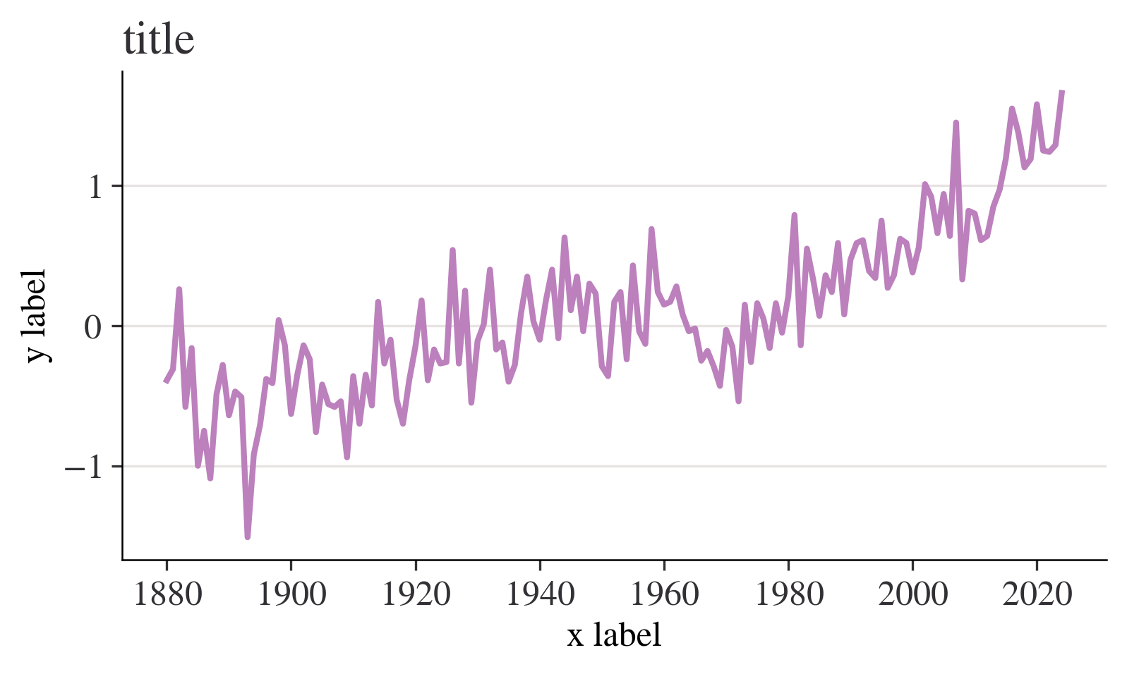
fig, ax = plt.subplots()
df["Jan"].plot(ax=ax)
ax.set_ylabel("y label")
ax.set_xlabel("x label")
ax.set_title("title")
plt.show()

fig, ax = plt.subplots()
ax.plot(df.index, df["Jan"])
ax.set_ylabel("y label")
ax.set_xlabel("x label")
ax.set_title("title")
plt.show()

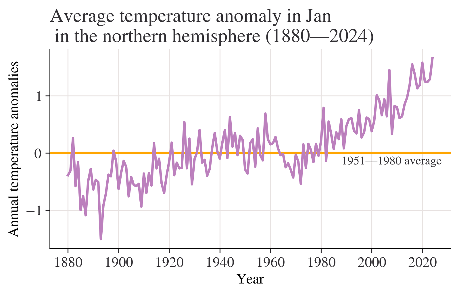
month = "Jan"
fig, ax = plt.subplots()
ax.axhline(0, color="orange")
ax.annotate("1951—1980 average", xy=(0.66, -0.2), xycoords=("figure fraction", "data"))
df[month].plot(ax=ax)
ax.set_title(
    f"Average temperature anomaly in {month} \n in the northern hemisphere (1880—{df.index.max()})"
)
ax.set_ylabel("Annual temperature anomalies");

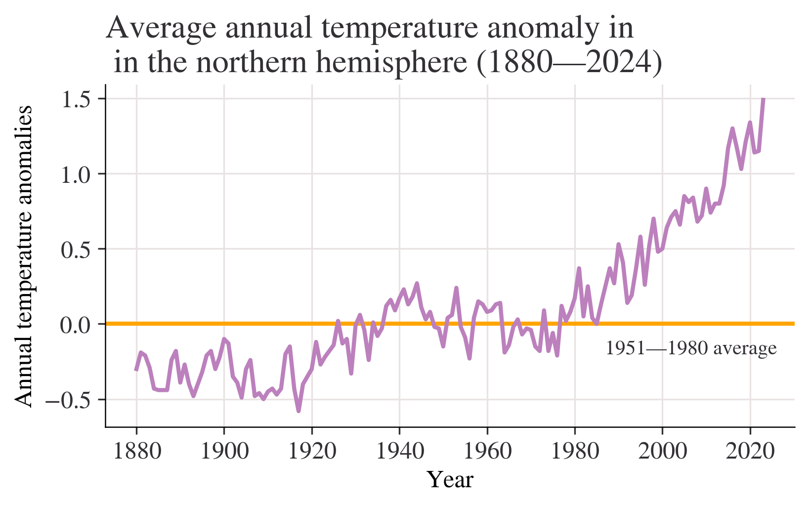
month = "J-D"
fig, ax = plt.subplots()
ax.axhline(0, color="orange")
ax.annotate("1951—1980 average", xy=(0.68, -0.2), xycoords=("figure fraction", "data"))
df[month].plot(ax=ax)
ax.set_title(
    f"Average annual temperature anomaly in \n in the northern hemisphere (1880—{df.index.max()})"
)
ax.set_ylabel("Annual temperature anomalies");

df["Period"] = pd.cut(
    df.index,
    bins=[1921, 1950, 1980, 2010],
    labels=["1921—1950", "1951—1980", "1981—2010"],
    ordered=True,
)
df["Period"].tail(20)
Year
2005    1981—2010
2006    1981—2010
2007    1981—2010
2008    1981—2010
2009    1981—2010
2010    1981—2010
2011          NaN
2012          NaN
2013          NaN
2014          NaN
2015          NaN
2016          NaN
2017          NaN
2018          NaN
2019          NaN
2020          NaN
2021          NaN
2022          NaN
2023          NaN
2024          NaN
Name: Period, dtype: category
Categories (3, object): ['1921—1950' < '1951—1980' < '1981—2010']
list_of_months = ["Jun", "Jul", "Aug"]
df[list_of_months].stack().head()
Year     
1880  Jun   -0.18
      Jul   -0.22
      Aug   -0.26
1881  Jun   -0.34
      Jul    0.09
dtype: float64
fig, axes = plt.subplots(ncols=3, figsize=(9, 4), sharex=True, sharey=True)
for ax, period in zip(axes, df["Period"].dropna().unique()):
    df.loc[df["Period"] == period, list_of_months].stack().hist(ax=ax)
    ax.set_title(period)
plt.suptitle("Histogram of temperature anomalies")
axes[1].set_xlabel("Summer temperature distribution")
plt.tight_layout();

# Create a variable that has years 1951 to 1980, and months Jan to Dec (inclusive)
temp_all_months = df.loc[(df.index >= 1951) & (df.index <= 1980), "Jan":"Dec"]
# Put all the data in stacked format and give the new columns sensible names
temp_all_months = (
    temp_all_months.stack()
    .reset_index()
    .rename(columns={"level_1": "month", 0: "values"})
)
# Take a look at this data:
temp_all_months
Year month values
0 1951 Jan -0.36
1 1951 Feb -0.51
2 1951 Mar -0.19
3 1951 Apr 0.07
4 1951 May 0.17
... ... ... ...
355 1980 Aug 0.09
356 1980 Sep 0.10
357 1980 Oct 0.12
358 1980 Nov 0.20
359 1980 Dec 0.09

360 rows × 3 columns

quantiles = [0.3, 0.7]
list_of_percentiles = np.quantile(temp_all_months["values"], q=quantiles)

print(f"The cold threshold of {quantiles[0]*100}% is {list_of_percentiles[0]}")
print(f"The hot threshold of {quantiles[1]*100}% is {list_of_percentiles[1]}")
The cold threshold of 30.0% is -0.1
The hot threshold of 70.0% is 0.1
# Create a variable that has years 1981 to 2010, and months Jan to Dec (inclusive)
temp_all_months = df.loc[(df.index >= 1981) & (df.index <= 2010), "Jan":"Dec"]
# Put all the data in stacked format and give the new columns sensible names
temp_all_months = (
    temp_all_months.stack()
    .reset_index()
    .rename(columns={"level_1": "month", 0: "values"})
)
# Take a look at the start of this data data:
temp_all_months.head()
Year month values
0 1981 Jan 0.79
1 1981 Feb 0.62
2 1981 Mar 0.68
3 1981 Apr 0.39
4 1981 May 0.18
entries_less_than_q30 = temp_all_months["values"] < list_of_percentiles[0]
proportion_under_q30 = entries_less_than_q30.mean()
print(
    f"The proportion under {list_of_percentiles[0]} is {proportion_under_q30*100:.2f}%"
)
The proportion under -0.1 is 1.94%
proportion_over_q70 = (temp_all_months["values"] > list_of_percentiles[1]).mean()
print(f"The proportion over {list_of_percentiles[1]} is {proportion_over_q70*100:.2f}%")
The proportion over 0.1 is 84.72%
temp_all_months = (
    df.loc[:, "DJF":"SON"]
    .stack()
    .reset_index()
    .rename(columns={"level_1": "Season", 0: "Values"})
)
temp_all_months["Period"] = pd.cut(
    temp_all_months["Year"],
    bins=[1921, 1950, 1980, 2010],
    labels=["1921—1950", "1951—1980", "1981—2010"],
    ordered=True,
)
# Take a look at a cut of the data using `.iloc`, which provides position
temp_all_months.iloc[-135:-125]
Year Season Values Period
443 1991 DJF 0.51 1981—2010
444 1991 MAM 0.45 1981—2010
445 1991 JJA 0.42 1981—2010
446 1991 SON 0.32 1981—2010
447 1992 DJF 0.43 1981—2010
448 1992 MAM 0.30 1981—2010
449 1992 JJA -0.04 1981—2010
450 1992 SON -0.15 1981—2010
451 1993 DJF 0.37 1981—2010
452 1993 MAM 0.31 1981—2010
grp_mean_var = temp_all_months.groupby(["Season", "Period"])["Values"].agg(
    [np.mean, np.var]
)
grp_mean_var
mean var
Season Period
DJF 1921—1950 -0.027931 0.057703
1951—1980 -0.003333 0.050375
1981—2010 0.522000 0.078644
JJA 1921—1950 -0.054483 0.021611
1951—1980 0.001333 0.014640
1981—2010 0.399000 0.067775
MAM 1921—1950 -0.041724 0.031136
1951—1980 0.000333 0.025272
1981—2010 0.507667 0.075812
SON 1921—1950 0.081379 0.027798
1951—1980 -0.001333 0.026384
1981—2010 0.427000 0.110739
min_year = 1880
(
    ggplot(temp_all_months, aes(x="Year", y="Values", color="Season"))
    + geom_abline(slope=0, color="black", size=1)
    + geom_line(size=1)
    + labs(
        title=f"Average annual temperature anomaly in \n in the northern hemisphere ({min_year}{temp_all_months['Year'].max()})",
        y="Annual temperature anomalies",
    )
    + scale_x_continuous(format="d")
    + geom_text(
        x=min_year, y=0.1, label="1951—1980 average", hjust="left", color="black"
    )
)
1951—1980 average 1880 1900 1920 1940 1960 1980 2000 2020 -1.0 -0.5 0.0 0.5 1.0 1.5 Average annual temperature anomaly in in the northern hemisphere (1880—2024) Annual temperature anomalies Year Season MAM JJA SON DJF
df_co2 = pd.read_csv("D:\Yang Fan\data\data2(1).csv")
df_co2.head()
Year Month Monthly average Interpolated Trend
0 1958 3 315.71 315.71 314.62
1 1958 4 317.45 317.45 315.29
2 1958 5 317.50 317.50 314.71
3 1958 6 -99.99 317.10 314.85
4 1958 7 315.86 315.86 314.98
df_co2_june = df_co2.loc[df_co2["Month"] == 6]
df_co2_june.head()
Year Month Monthly average Interpolated Trend
3 1958 6 -99.99 317.10 314.85
15 1959 6 318.15 318.15 315.92
27 1960 6 319.59 319.59 317.36
39 1961 6 319.77 319.77 317.48
51 1962 6 320.55 320.55 318.27
df_temp_co2 = pd.merge(df_co2_june, df, on="Year")
df_temp_co2[["Year", "Jun", "Trend"]].head()
Year Jun Trend
0 1958 0.05 314.85
1 1959 0.14 315.92
2 1960 0.18 317.36
3 1961 0.18 317.48
4 1962 -0.13 318.27
(
    ggplot(df_temp_co2, aes(x="Jun", y="Trend"))
    + geom_point(color="black", size=3)
    + labs(
        title="Scatterplot of temperature anomalies vs carbon dioxide emissions",
        y="Carbon dioxide levels (trend, mole fraction)",
        x="Temperature anomaly (degrees Celsius)",
    )
)
-0.2 0.0 0.2 0.4 0.6 0.8 1.0 320 340 360 380 400 Scatterplot of temperature anomalies vs carbon dioxide emissions Carbon dioxide levels (trend, mole fraction) Temperature anomaly (degrees Celsius)
df_temp_co2[["Jun", "Trend"]].corr(method="pearson")
Jun Trend
Jun 1.000000 0.914371
Trend 0.914371 1.000000
(
    ggplot(df_temp_co2, aes(x="Year", y="Jun"))
    + geom_line(size=1)
    + labs(
        title="June temperature anomalies",
    )
    + scale_x_continuous(format="d")
)
1960 1970 1980 1990 2000 2010 -0.2 0.0 0.2 0.4 0.6 0.8 1.0 June temperature anomalies Jun Year
base_plot = ggplot(df_temp_co2) + scale_x_continuous(format="d")
plot_p = (
    base_plot
    + geom_line(aes(x="Year", y="Jun"), size=1)
    + labs(title="June temperature anomalies")
)
plot_q = (
    base_plot
    + geom_line(aes(x="Year", y="Trend"), size=1)
    + labs(title="Carbon dioxide emissions")
)
gggrid([plot_p, plot_q], ncol=2)
1960 1970 1980 1990 2000 2010 -0.2 0.0 0.2 0.4 0.6 0.8 1.0 June temperature anomalies Jun Year 1960 1970 1980 1990 2000 2010 320 340 360 380 400 Carbon dioxide emissions Trend Year
Source: Create a variable that has years 1951 to 1980, and months Jan to Dec (inclusive)